
Brand project · 02
Light Threads
The starting point
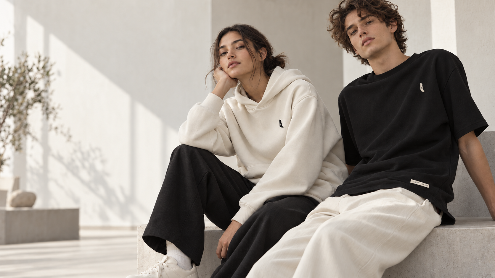
Create a brand people want to wear before they even read its story.
Light Threads needed a presence that could be noticed without shouting. We built a restrained, tactile and precise language where black, ivory and generous space allow the clothing to lead.
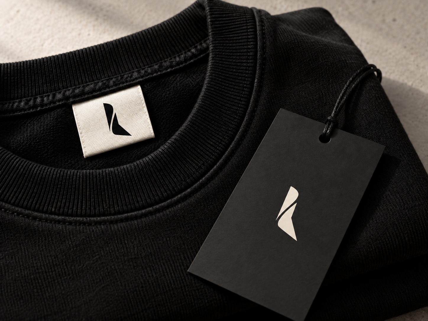
The symbol works as a discreet signature, while the name brings the rhythm and recognition a young fashion brand needs.
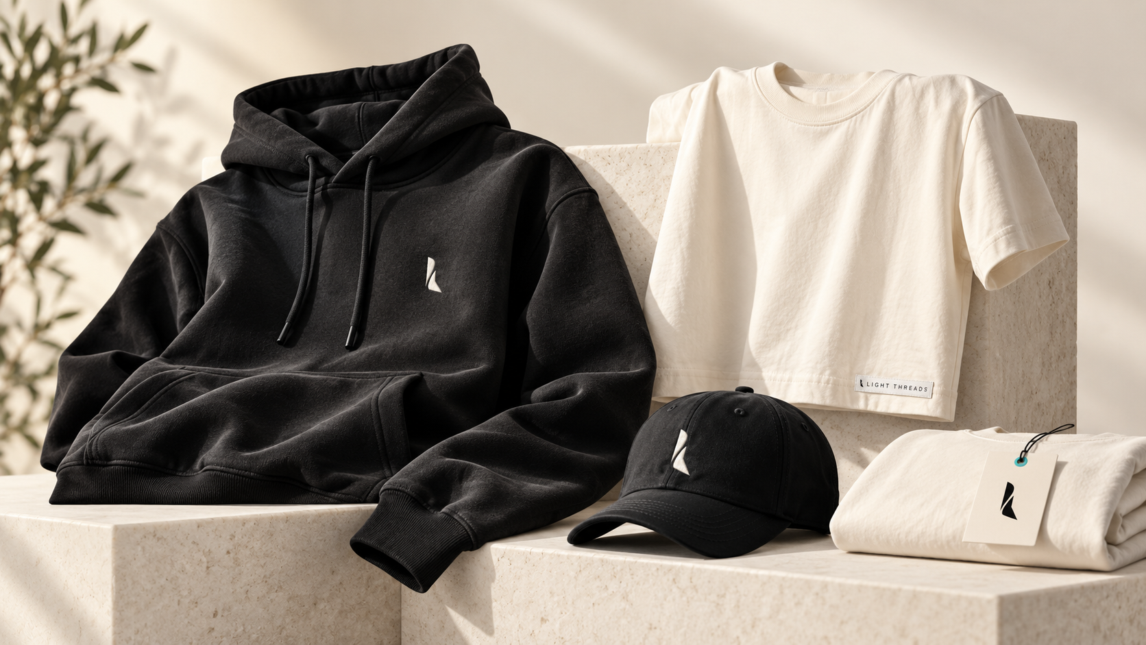
A clothing brand is not judged on a technical sheet. It is recognised through cut, material and detail.
The experience
The brand continues long after the garment is chosen.
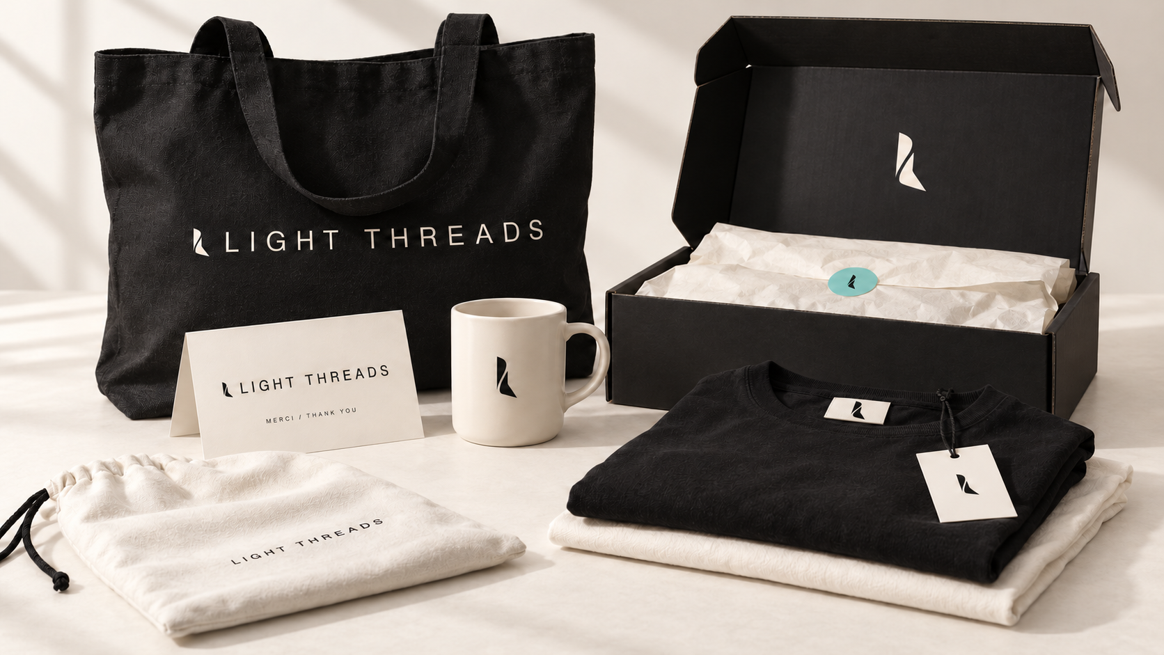
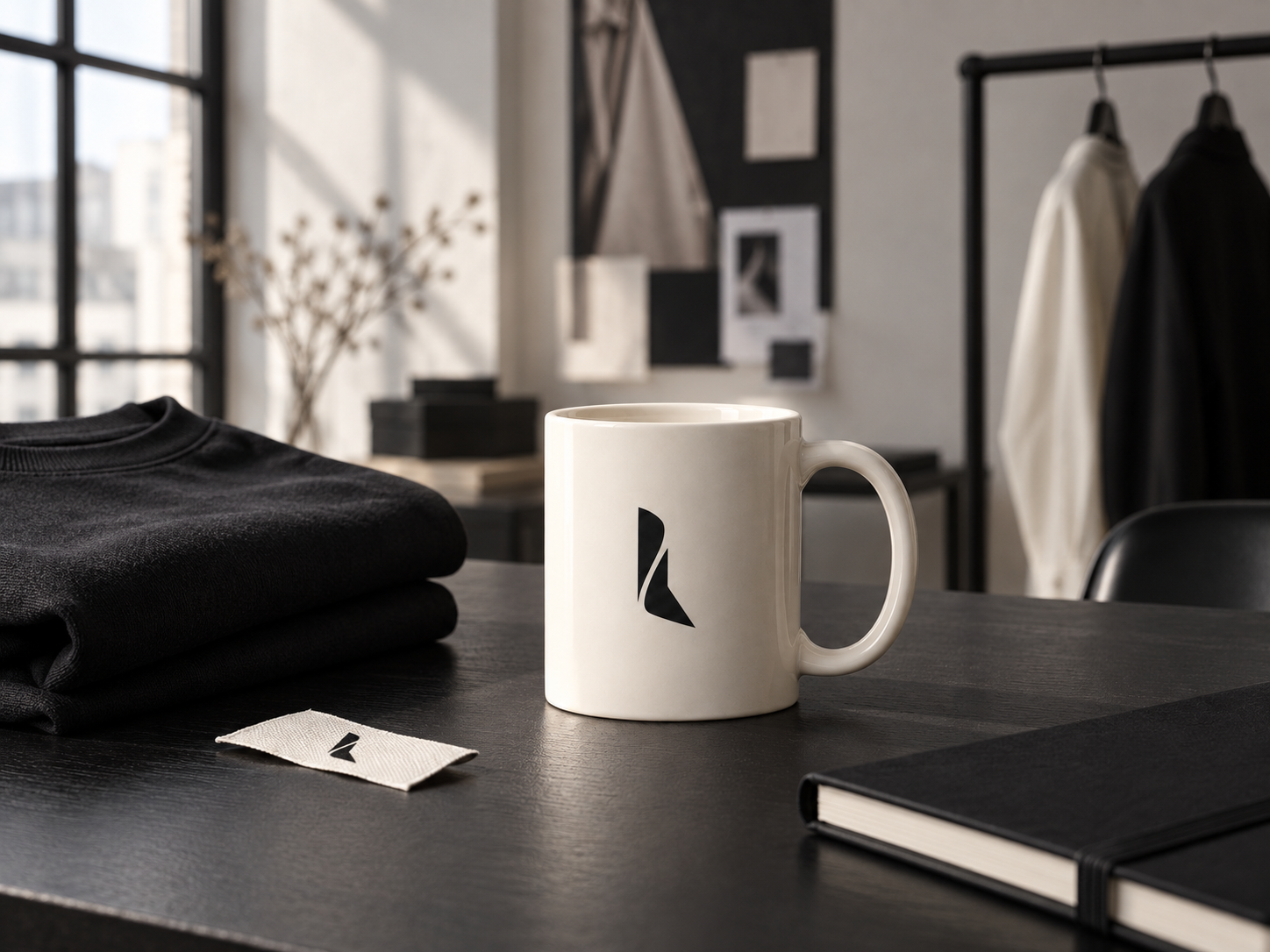
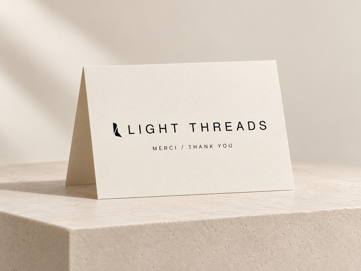
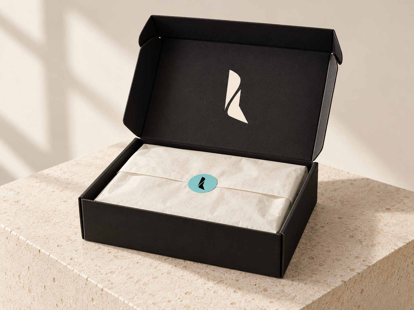
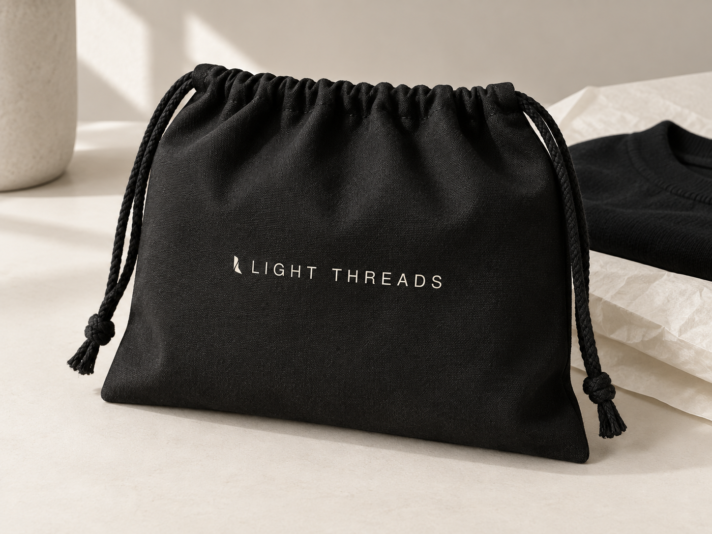
The tote, mug, thank-you card, box, tissue paper and pouch extend the same world. Every object has a clear role in the experience, while the symbol and wordmark are used with restraint.
The direction
A light, precise signature that stays quiet enough to let the clothes speak.
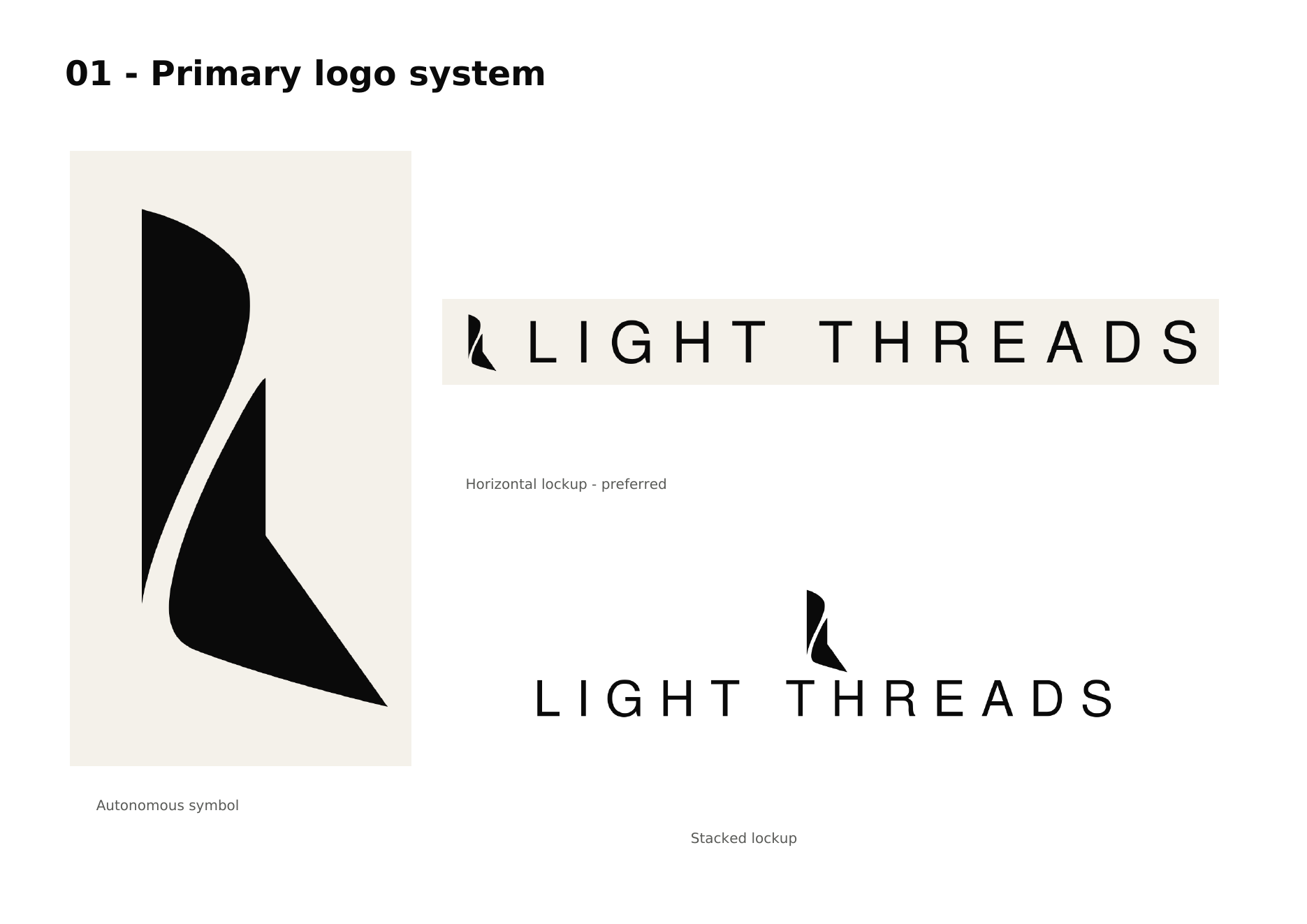
The widely spaced wordmark creates a contemporary presence. The vertical symbol can stand alone on embroidery, a label or an accessory without becoming a different logo every time it is applied.
This restraint gives the brand a more premium character and makes every touchpoint immediately identifiable.

The system
From name to detail, every application keeps the same signature.
The horizontal lockup, stacked version and autonomous symbol answer different spaces without changing the design. The system is flexible enough to dress a collection while protecting the brand's consistency.
Public deployment
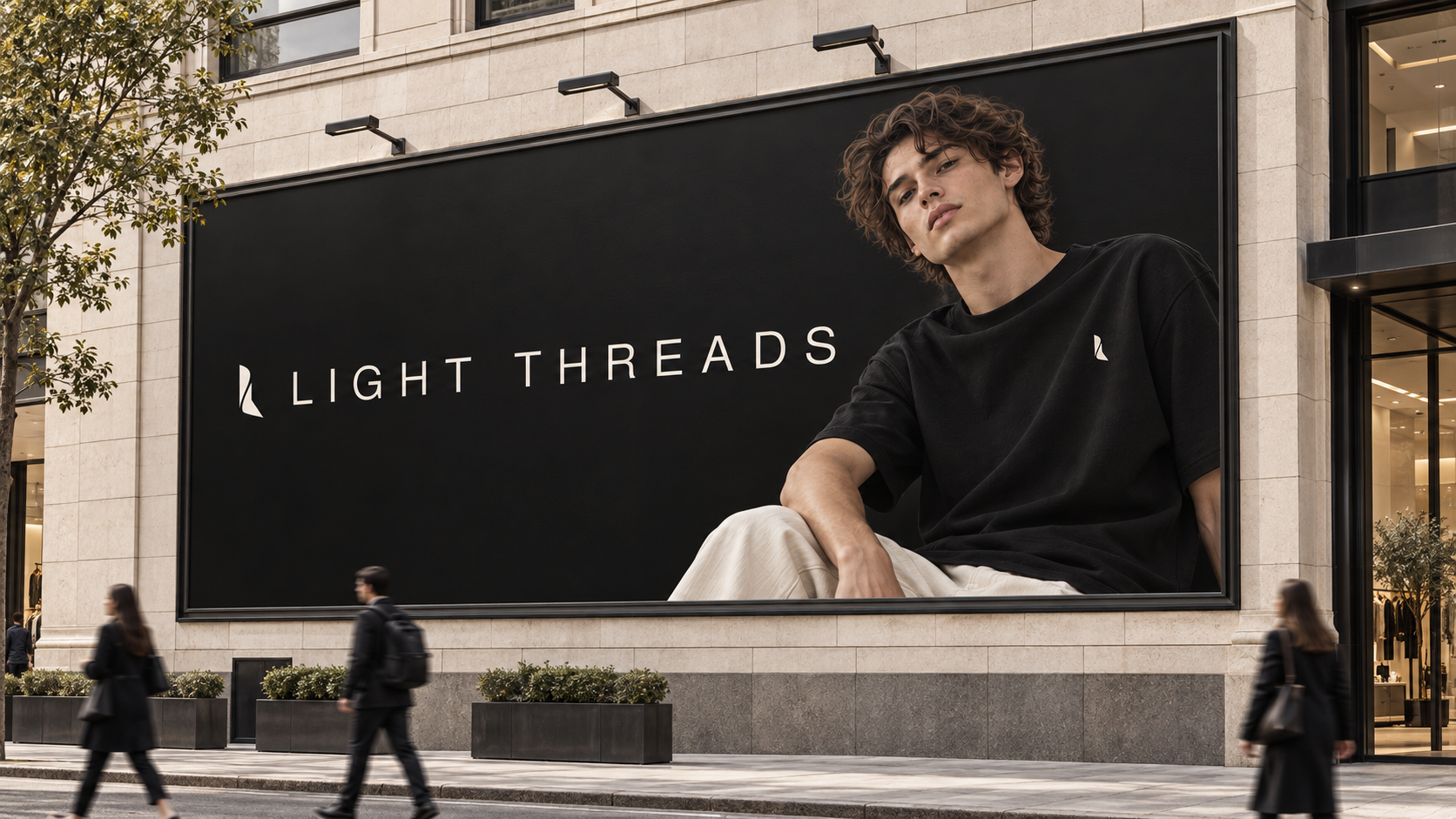
An identity designed to be recognised at the scale of the city.
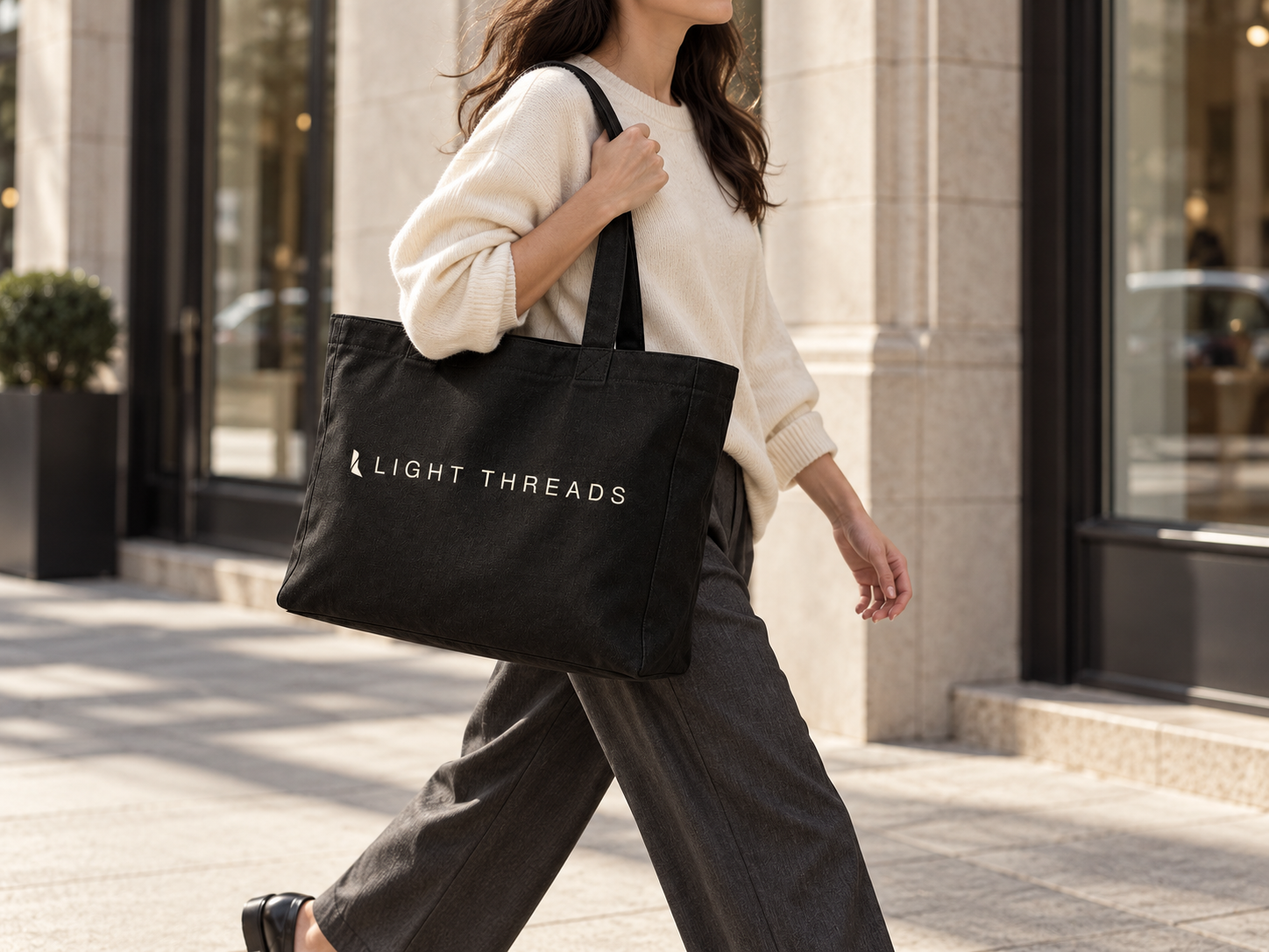
The banner carries the same black-and-ivory system into public space: the garment leads the image while the wordmark remains legible from a distance.
Outcome
An identity ready to live across a collection.
Light Threads now has a coherent world, a recognisable mark and a system flexible enough to move from garment to label, then from campaign imagery to digital without losing its character.
Your project