
Case study · 01
Kairos & Co
Context
Giving clear form to deeply human expertise.
Kairos & Co helps organizations make better human resources decisions and build stronger people practices. The consulting firm needed a brand that reflected its approach: structured without feeling cold, approachable without losing authority, and equally natural in English and French.
The mandate therefore went well beyond a logo. We needed to build a complete identity ready for everyday conversations, business development, events and professional document production.
Make HR consulting reassuring and distinctive — without relying on interchangeable corporate codes.
Challenge
Balancing authority, warmth and consistency at every touchpoint.
The brand had to earn the trust of leaders, teams and partners with very different realities. It also needed to remain legible at every size, withstand office and print constraints, and retain the same presence on a name badge, a proposal or a LinkedIn profile.
That need for consistency shaped every decision: a simple mark, a disciplined palette, an accessible typeface and rules precise enough to prevent guesswork when the work moved into production.
Thinking
The right moment becomes a method, not a decorative promise.
“Kairos” names the opportune moment: the point when a decision, conversation or intervention can genuinely move things forward. We translated that idea into a visual system where structure and movement work together.
The chosen direction moves away from familiar industry clichés — silhouettes, handshakes and generic people icons — to build a proprietary brand that can communicate discernment, progress and care.
Concept
An open “O,” a trajectory and a decisive point.
The symbol directly replaces the “O” in KAIROS. Its open circle suggests a path in motion; the violet point marks the decisive moment when insight becomes action. By embedding the symbol in the word rather than placing it beside the name, the concept becomes inseparable from the brand.
The construction was refined to preserve the optical balance of the wordmark, with standard and simplified versions for small-format use.

The system in action
The symbol carries the idea. The applications prove the coherence.
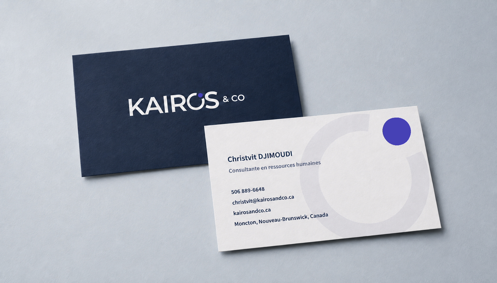
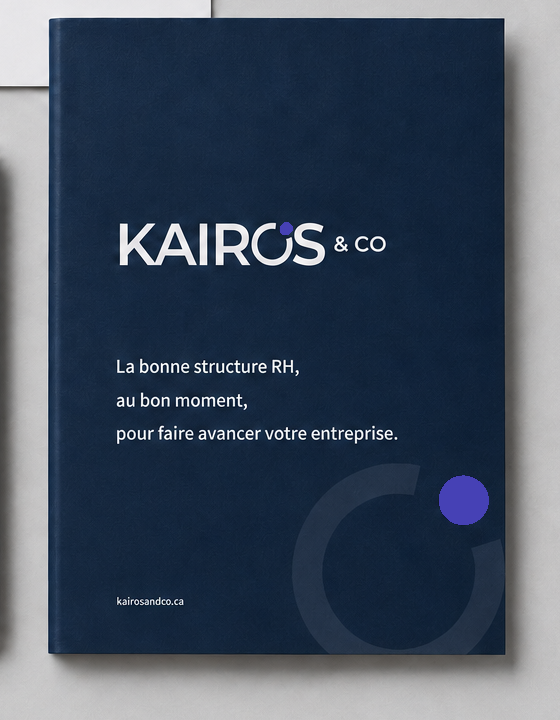
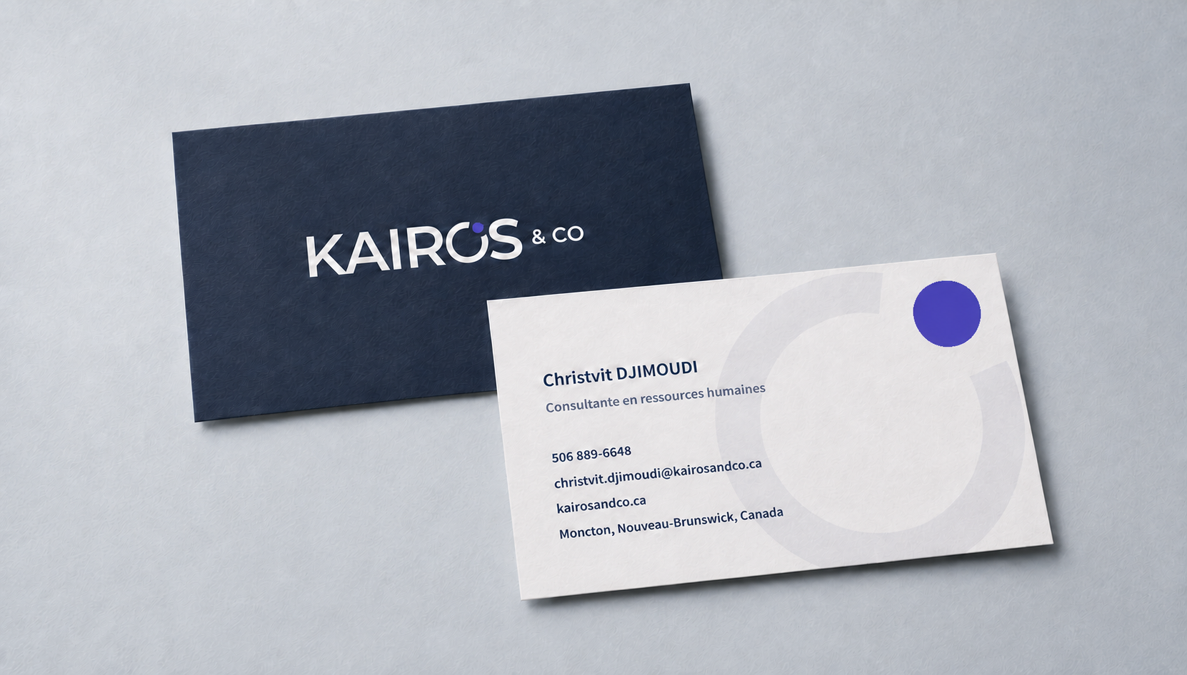
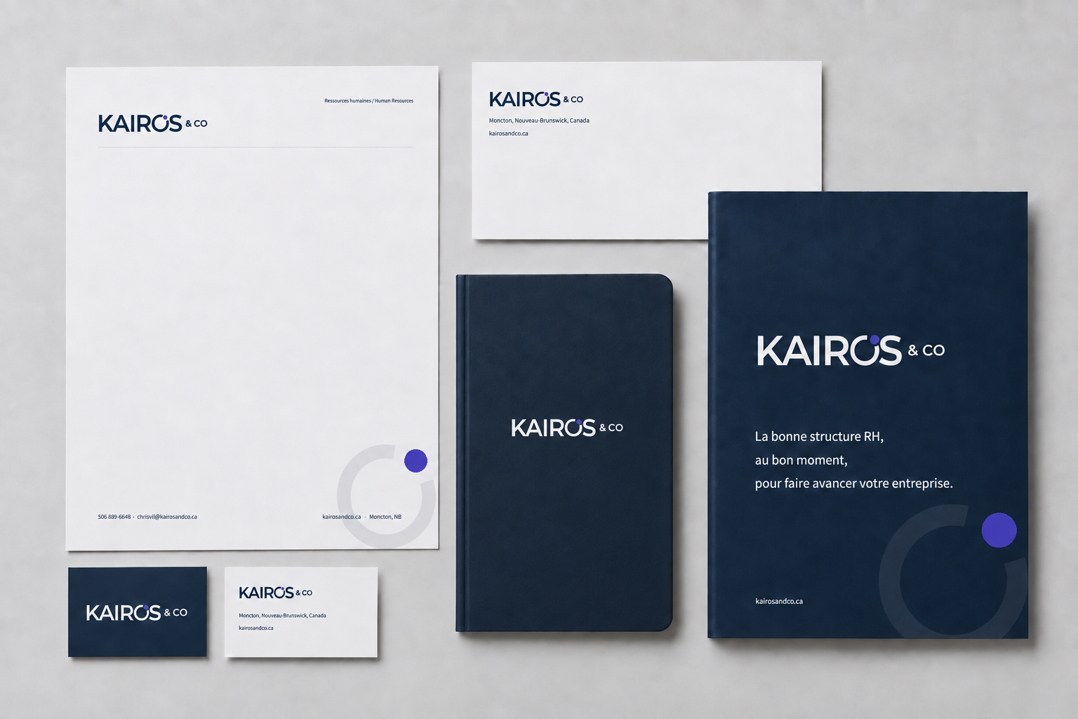
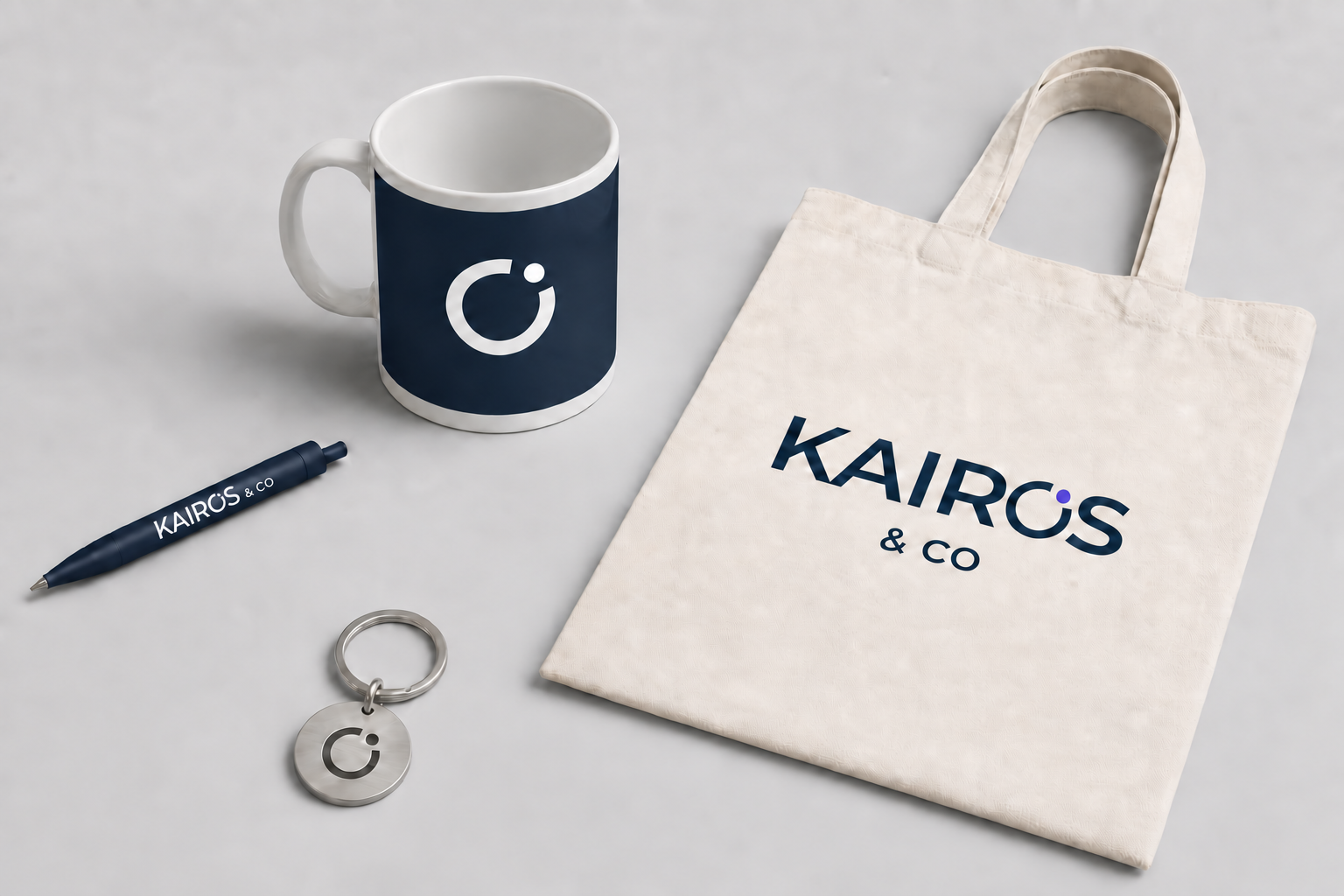
On its own, the mark preserves the idea of the right moment. On the business card, stationery and presentation folder, it becomes a quiet cue connecting every touchpoint without making them identical.
System
A deliberately focused identity built to stay strong everywhere.
Kairos Navy establishes trust and carries most of the visual system. Moment Violet is used with restraint as a functional accent and point of orientation. Montserrat gives the brand a clear, contemporary and accessible voice, with Arial specified as a fallback in constrained office environments.
Horizontal and vertical lockups, clear space, minimum sizes, contrast rules and Pantone, CMYK and digital specifications turn the identity into a practical working tool.
06 · Applications
From the first conversation to an on-site presence.
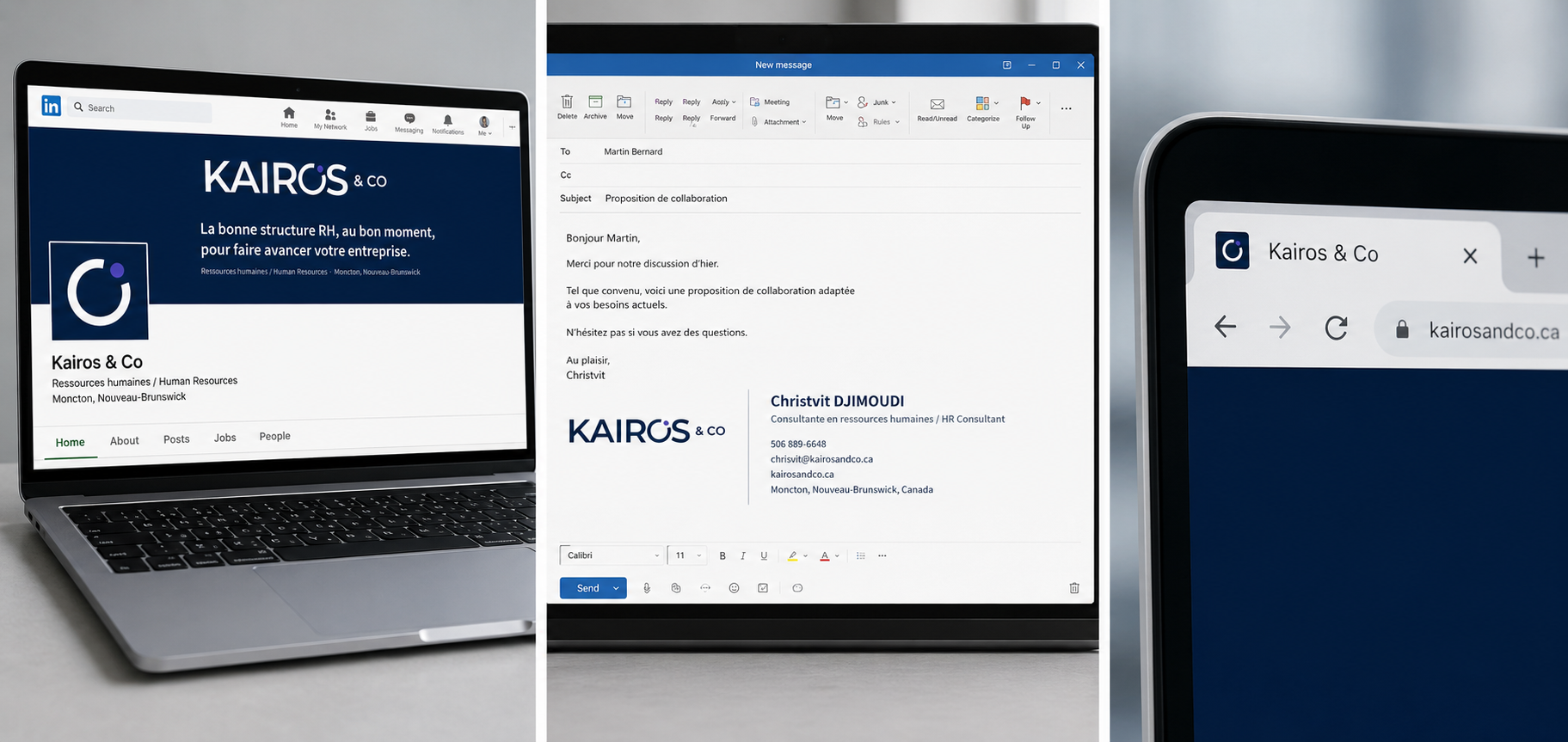
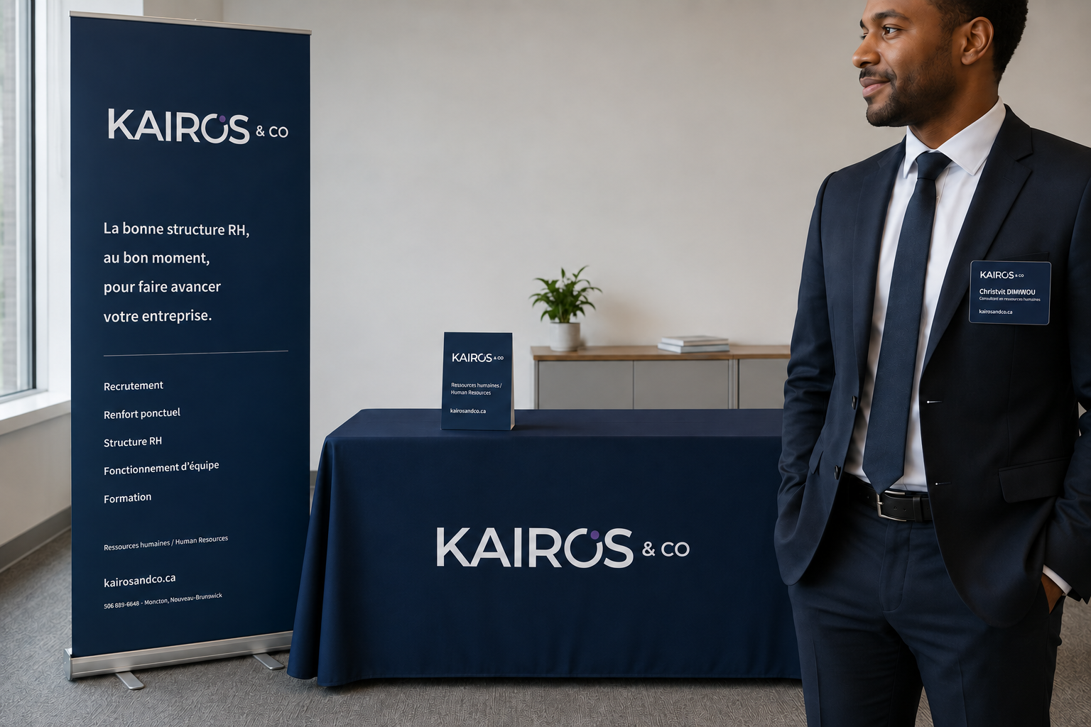
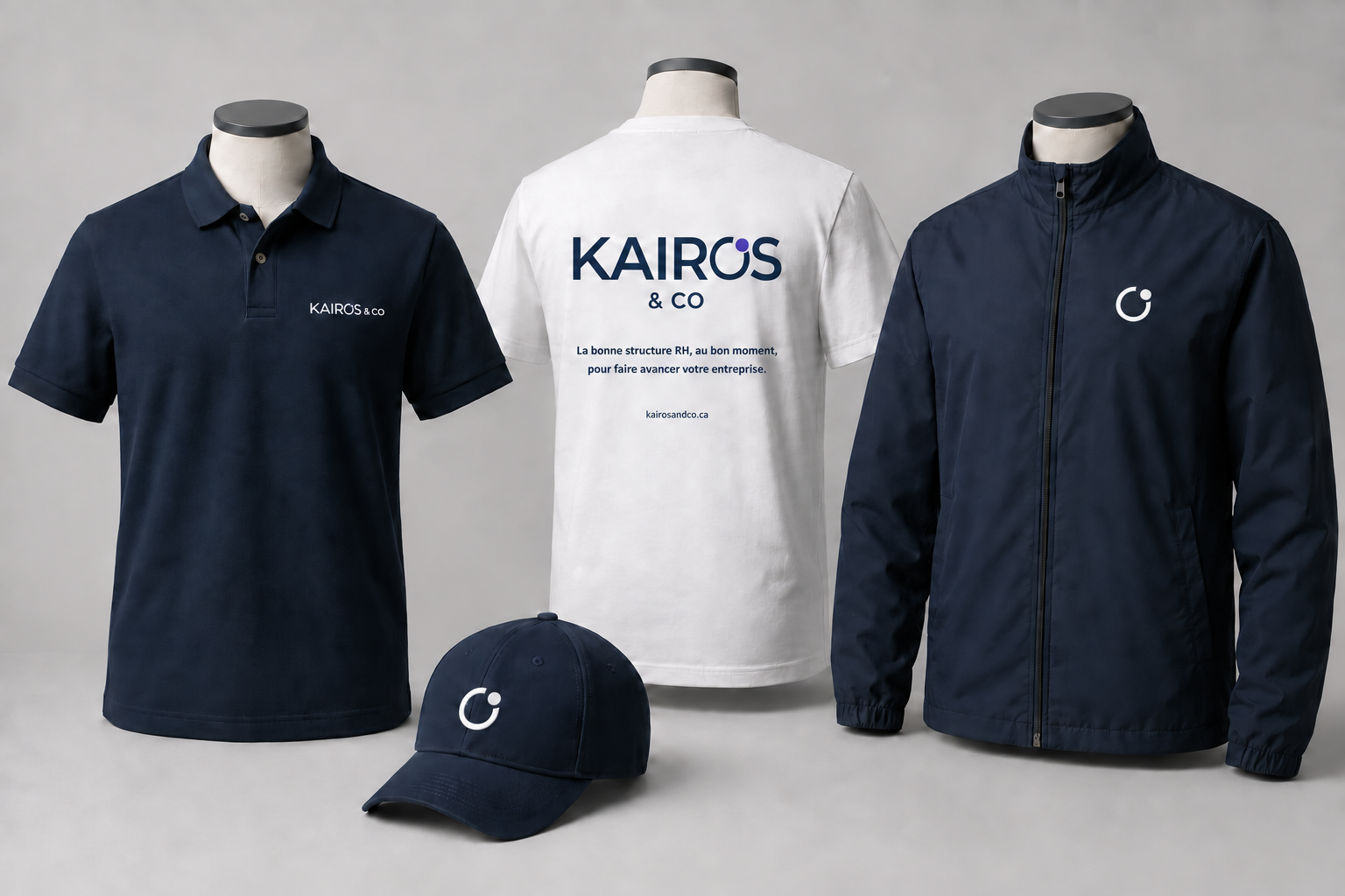
The system was extended across the touchpoints that shape Kairos & Co’s client relationships and visibility: stationery, digital tools, event signage, apparel and branded objects. Every application preserves the hierarchy, proportions and restraint of the core language.
Outcome
A brand ready to work, not merely to be admired.
Kairos & Co now has a proprietary, bilingual and rigorously documented language. The identity can move from a one-to-one conversation to an event environment without changing tone or losing recognition.
07 · Deliverables